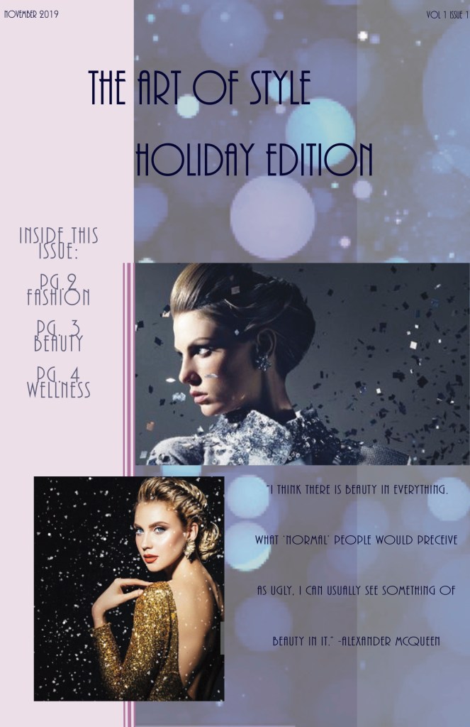
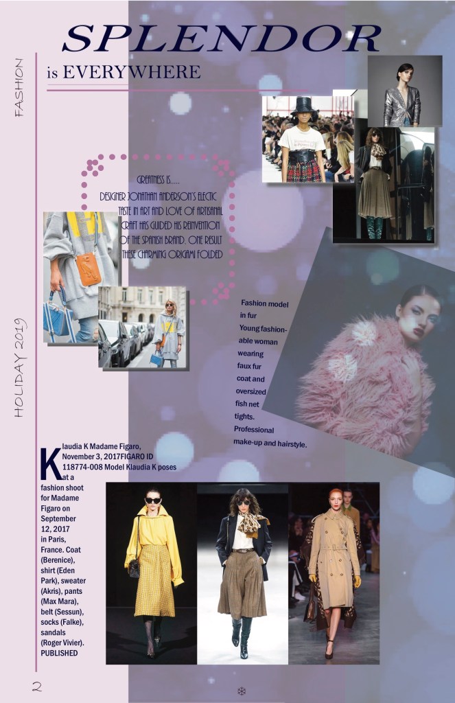
Newsletter
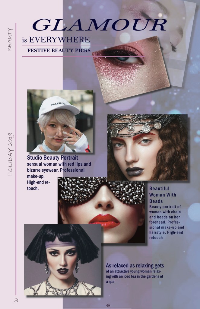
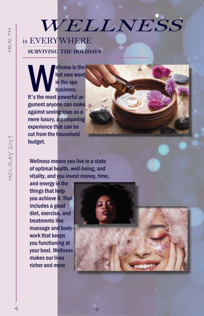
For my third project I created a newsletter with the help of InDesign. With this I was able to expand from my logo design. I used some of the tools I learned while working on previous projects and put them to use. With various pictures I found on Getty and google I kept the same color scheme and feel throughout. The newsletter consisted of three different working color layers in total, but each page has a different layout. By using drop shadows and drop caps, when looking at each page individually you are able to see similarities wile still seeing differences. I did not want to use a lot of columns because I felt that it would take away from the fashion editorial feel of the newsletter.
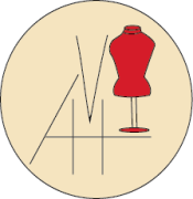
Logo
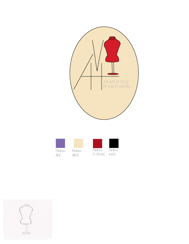
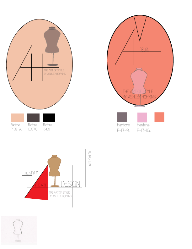
For my second project I created a logo design for my brand using Illustrator. I sketched different ideas until I could find one that matched the aesthetic I was looking for. I used tools as the circle tool and pen tool to achieve the lines I wanted in my initials. I kept the slogan inside the actual logo instead of having it to the side. The logo looked like it was just floating without the circle and there were no boundaries without it.
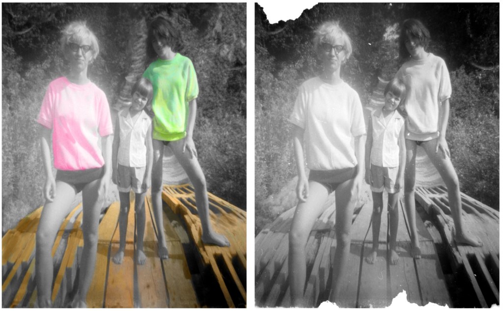
Retouch Photo
For our first project we used photoshop to retouch and add color to a photo. With this project I needed to uses various tools in the library. The clone tool became my bestfriend in trying to recreate some of the missing elements in the photo. The brush tool came in handy most when working on the coloring.